Google updates its logo for the first time in a decade—did you spot the change?
By
Veronica E.
- Replies 0
If you opened the Google app recently and something looked a little different, you weren’t imagining it.
The tech giant just gave its iconic “G” logo a refresh for the first time in 10 years—but unless you have a sharp eye for color and design, the update may have been easy to miss.
At first glance, it still looks like the same cheerful, colorful “G” we’ve come to recognize on smartphones, tablets, and computers around the world.
But on closer inspection, the solid color blocks that once defined the letter have been replaced with a softer, more modern gradient effect.
It’s a subtle shift—but one that reflects bigger trends in technology, design, and the future direction of the company.
So what changed, and why now? Here’s a closer look at Google’s latest design update—and what it might signal about what’s next.
.jpeg")
Since 2015, the Google “G” has stood out with four bold colors—blue, red, yellow, and green—each in its own clean, blocky section.
The latest version keeps those familiar colors, but they now blend smoothly into one another in a gradient pattern.
This new, softer look is already appearing in the Google app on smartphones and tablets.
It’s a simple visual update, but in the tech world, even small changes can mean something more.
The redesigned logo ties in with Google’s broader shift toward artificial intelligence.
If you’ve used Gemini, Google’s new AI chatbot, you may have noticed that same blended-color design in its logo.
The new “G” is part of that visual language—helping tie Google’s traditional services to its growing AI efforts.
In short, it’s a small way to say: “We’re changing with the times.”
For longtime internet users, this isn’t the first change to Google’s look:
Now, in 2024, the newly updated “G” adds a modern touch without straying too far from the familiar.
At the moment, the new gradient-style logo only appears in the main Google app. Other apps like Gmail, Google Maps, Calendar, and Drive still use the older, more defined block-style colors.
That could change soon. Google tends to roll out design updates gradually, so you might notice other app icons shifting to this new look over the coming months.

Curious about the update? Here’s how to spot it:
It may be subtle, but it’s a fun detail to notice—and a sign of how design can reflect change.
To some, a logo tweak might seem minor.
But these small changes are often tied to bigger shifts in how companies present themselves—and how they want to be seen by users.
In this case, it’s a quiet way for Google to say: “We’re evolving.”
And for those of us who’ve been online for decades, these changes remind us how quickly technology moves—and how companies adapt over time.
Read next: Gmail’s game-changing move to tackle spam—say goodbye to junk mail!

Did you notice the logo change before reading about it? Do you have a favorite version of the Google logo from the past? How do you feel about companies making these small updates? We’d love to hear your take—drop your thoughts in the comments section. Sometimes, the smallest changes spark the biggest conversations!
The tech giant just gave its iconic “G” logo a refresh for the first time in 10 years—but unless you have a sharp eye for color and design, the update may have been easy to miss.
At first glance, it still looks like the same cheerful, colorful “G” we’ve come to recognize on smartphones, tablets, and computers around the world.
But on closer inspection, the solid color blocks that once defined the letter have been replaced with a softer, more modern gradient effect.
It’s a subtle shift—but one that reflects bigger trends in technology, design, and the future direction of the company.
So what changed, and why now? Here’s a closer look at Google’s latest design update—and what it might signal about what’s next.
.jpeg")
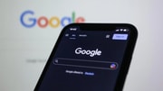
Google’s updated “G” logo now features a smooth color gradient—its first major design change in a decade. Image Source: Pexels / Bastian Riccardi.
A small update with a modern feel
Since 2015, the Google “G” has stood out with four bold colors—blue, red, yellow, and green—each in its own clean, blocky section.
The latest version keeps those familiar colors, but they now blend smoothly into one another in a gradient pattern.
This new, softer look is already appearing in the Google app on smartphones and tablets.
It’s a simple visual update, but in the tech world, even small changes can mean something more.
Also read: 10,000 lies and a lawsuit—Google takes action against scammers
Why did Google make this change?
The redesigned logo ties in with Google’s broader shift toward artificial intelligence.
If you’ve used Gemini, Google’s new AI chatbot, you may have noticed that same blended-color design in its logo.
The new “G” is part of that visual language—helping tie Google’s traditional services to its growing AI efforts.
In short, it’s a small way to say: “We’re changing with the times.”
Also read: Millions at risk: The crucial Google setting you need to check NOW to avoid a dangerous new phone scam
Google’s logo through the years
For longtime internet users, this isn’t the first change to Google’s look:
- 1997: Google’s very first logo had a green “G” and even an exclamation point.
- 1999 to 2010: The color order we know today became the standard.
- 2015: The last major update gave us the clean, sans-serif font we see now.
Now, in 2024, the newly updated “G” adds a modern touch without straying too far from the familiar.
What about other Google icons?
At the moment, the new gradient-style logo only appears in the main Google app. Other apps like Gmail, Google Maps, Calendar, and Drive still use the older, more defined block-style colors.
That could change soon. Google tends to roll out design updates gradually, so you might notice other app icons shifting to this new look over the coming months.

The refreshed Google logo blends its classic colors in a new gradient style, reflecting the company’s evolving design and focus on AI. Image Source: YouTube / Will Paterson.
Also read: 1.8 billion at risk: New email threat raises security concerns. Are you protected?
Want to see the difference?
Curious about the update? Here’s how to spot it:
- Open the Google app on your phone or tablet.
- Look at the “G” icon. Notice how the colors now blend together, rather than sitting in neat blocks.
- Compare it to other Google apps like Gmail or Maps—you’ll spot the difference.
It may be subtle, but it’s a fun detail to notice—and a sign of how design can reflect change.
To some, a logo tweak might seem minor.
But these small changes are often tied to bigger shifts in how companies present themselves—and how they want to be seen by users.
In this case, it’s a quiet way for Google to say: “We’re evolving.”
And for those of us who’ve been online for decades, these changes remind us how quickly technology moves—and how companies adapt over time.
Read next: Gmail’s game-changing move to tackle spam—say goodbye to junk mail!
Key Takeaways
- Google has updated its “G” logo for the first time since 2015, switching to a blended gradient style.
- The change reflects Google’s growing focus on artificial intelligence and aligns with its Gemini AI branding.
- The new logo currently appears in the main Google app; other Google apps like Gmail and Drive still use the older block-style icons.
- Design updates like this often hint at larger shifts in technology and branding strategy.
Did you notice the logo change before reading about it? Do you have a favorite version of the Google logo from the past? How do you feel about companies making these small updates? We’d love to hear your take—drop your thoughts in the comments section. Sometimes, the smallest changes spark the biggest conversations!